
New York City: Time to Sell?
There is reason to believe that the current burden of the migrants taking advantage of New York City’s sanctuary city status may bankrupt it in the next 12 to 24 months.
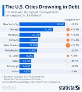
The city’s current debt is $132 billion. And yet, Mayor Adams and other city officials are planning on spending a lot more between now and the end of 2025 to pay for the housing, feeding, clothing, and other needs of this additional population.
The city already provides undocumented immigrants with Medicaid and the full range of welfare services for the first seven years of their time spent in the city. City officials believe they will spend $12 billion by the end of the 2025 fiscal year on this alone.
And now they are working on the idea of giving the migrants $350 a week via prepaid debit cards that are supposed to be used to purchase food and supplies for babies. It’s a pilot program that will be tested on 460 families and will cost the city $600,000 a month, or $7.2 million in the first year. But as best as I can ascertain, since 2022, NYC’s migrant population has grown from about 560,000 to about 800,000. And if my arithmetic is right, that means the city would eventually have to come up with an extra $3 billion in taxes to expand the program.
On top of all that, they have a serious problem with office buildings being underoccupied since COVID that has been costing the city billions of dollars a year in lost real estate tax income.
Based on everything I’ve read, I’d not be surprised to see the city’s debt top $200 billion within the next few years.
The only way for Mayor Adams and city officials to try to avoid that would be to drastically increase taxes even more than they’ve already been doing – a tactic that has backfired, with wealthy residents and large, tax-paying companies beginning to relocate out of the city and into less costly municipalities.
If I owned property in NYC, I’d be looking to sell it now.
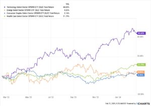
Chart of the Week: Time for Non-US Stocks?
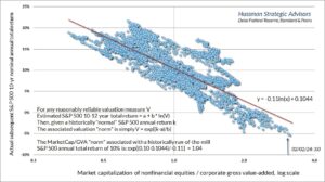
This week, Sean looks at the US stock market and highlights how expensive US stocks have become. (I’ve had conversations about this with several of the best analysts at The Agora Companies, which publishes dozens of economic, wealth, and financial advisories.)
From a value investing perspective, many US stocks, especially the sort of stocks we hold in the Legacy Portfolio are expensive – at a level that, like Sean, I’d be reluctant to buy more of them.
US stocks represent the majority of my investment in stocks, but stocks represent only about 20% of my wealth portfolio. Much of the rest is comprised of hard assets, real estate, and direct ownership of businesses, some of which are overseas. So, that gives my overall wealth portfolio some “anti-fragility.” If your wealth is primarily in US stocks, you should heed Sean’s warning today.
As US stocks inch ever higher, I find myself less interested in them.
I do not wish to overpay for something that, by any valuation measure, seems so unattractive.
This has led me to seek opportunities in gold and bonds. Now, I am looking at emerging markets.
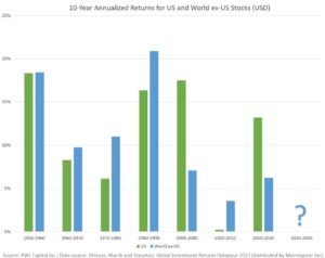
Global markets excluding the US stock market have outperformed the US in five of the last seven decades.
It raises some questions: Why should this decade be different?
Many other investors are starting to ask the same thing.
According to analysts from Bank of America, the shift into emerging market and eurozone equities has been remarkable, with movement into non-US stocks the highest it’s been in seven years.
The last time we saw US stock valuations this high, in the year 2000, non-US stocks proceeded to outperform US stocks in seven of the following 10 years.
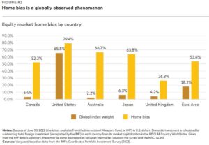
This is cause for concern because, simply, most American investors, especially index investors, believe they have a well-diversified portfolio. Yet most of them do not hold non-US stocks.
Having international assets, like real estate, can help hedge against currency fluctuations. They also allow investors to gain exposure to shifting growth trends.
The most exciting of those growth trends seem, to me, to be in South America, Central America, and Japan. (Though I am keeping an eye on Europe.)
Western Latin countries are benefitting heavily from the trend of nearshoring, where US firms are relocating manufacturing and operations to nearby countries.
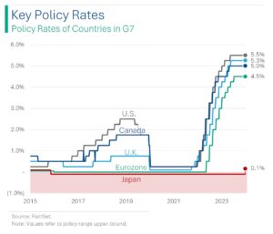
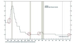
And Japan is starting to see growth again after decades of stagnation.
One thing I will be doing in the coming months is looking for a non-US stock to add to the Legacy Portfolio. In July, I will be revealing what I discover on a stage in Tokyo.
But investors should consider shifting about 30% of their portfolio to non-US assets, like international stocks, now.
That might involve taking some gains on US growth stocks and moving them into non-US assets. Or it might simply involve buying non-US assets with your dividends or any new contributions you make to your investment portfolios.
– Sean MacIntyre
Check out Sean’s YouTube channel here.