
Chart of the Week: It’s Up! It’s Down! What’s Going on with Nvidia?
Thanks to my broker Dominick’s recommendation, I was an early investor in Nvidia, and profited very handsomely from it.
From the start, there was all sorts of hype about the company, which Dominick and I discussed several times during our monthly meetings. The result was that we gradually lowered my position size by pocketing a lot of the profits and reinvesting them elsewhere.
Recently, there’s been another public conversation about Nvidia, with some pundits very bullish on it and some quite skeptical.
Last week, I sent an email to both Dominick and Sean, asking them how they see the future of the company and its share price. Their perspectives were largely similar, which gave me some comfort.
Below is what Sean had to say. – MF
I received Mark’s message about Nvidia at the same moment – literally – that I was finishing a column comparing Nvidia’s and Broadcom’s rise in recent years to Cisco and Qualcomm in the year 2000.
Even if Nvidia has not reached the same insane, anoxic heights of Cisco’s valuation…
The parallels do provide an interesting glimpse into the nature of bubbles and the allure of stocks caught up in a wave of legitimate but extreme exuberance.
Because I do believe that, like the internet in 2000, AI and machine learning services for consumers and businesses is very much the future.
Just as early adopters of the internet created webpages that sent many designers to an early grave…
AI image generators now produce portraits of people that sometimes look like an uncanny tangle of knuckles.
But we can certainly imagine a future when AI writes or generates images that feel more… usable, and not merely a novelty.
And that’s why people are excited about Nvidia. Or, at least, Nvidia’s chip architecture and CUDA platform.
You see, Nvidia makes chips that are quite good at doing lots of linear algebra, calculus, and matrix multiplication very fast – which is all a neural net AI algorithm is, really.
This proved exceptionally useful for calculating vectors in video game graphics, and then running hashing algorithms on block data to mine cryptocurrencies, and then molecular modeling simulations, and then doing machine learning on very big datasets necessary for modern AI algorithms.
The “edge” that Nvidia’s chips possess is their ability to break complex tasks into thousands of smaller operations that can be worked on in parallel.
This is the main reason why I recommended buying Nvidia in June 2022, after it had fallen about -50% in a few months.
But with the explosion of AI, Nvidia’s prospects look nothing shy of extraordinary.
Sources say it took about 10,000 Nvidia A100 GPU processors to train OpenAI’s GPT-3 model.
Nvidia’s A100 chips cost about $10,000 each.
And that’s just one of many AI applications that Nvidia’s chips are being used for.
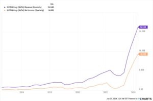
Do some quick multiplication, and you can see why Nvidia’s revenue and profit in recent years looks like a scythe.
But that, alone, would not justify Nvidia’s insane valuations at the moment.
For that, investors would need to see further growth. Accelerated growth. Sustainable growth.
So here’s why some investors think this growth will continue for years to come:
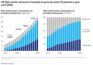
There are about 10,300 data centers in the world as I write this. By 2030, it’s estimated that we’ll have 2 to 4 times as many.
A medium-size data center can hold about 50 to 100 server racks, while a very large one can hold 5,000 or more.
A standard rack can hold 40 to 50 server computers.
Each server computer can hold up to 10 GPUs or more. (Really, cooling and power are the limiting factors there. So innovations might increase this number.)
Future AI models with more data and more parameters may require 30,000 training GPUs or more to train in a reasonable amount of time.
And while the A100s cost $10,000, Nvidia’s new Blackwell chips will cost $30,000 to $40,000 each.
Once you start multiplying these numbers together… we’re suddenly talking about the potential for trillions of dollars of revenue in the coming years and decades.
If you make some very charitable assumptions, find the net present value of all that future revenue, carry the one, drop some acid, and delude yourself into believing that exponential growth is a real thing…
You can start to imagine why an investor, especially an inexperienced or excessively optimistic investor, might look at Nvidia’s valuations as “fair” or “reasonable.”
So if you want to know why folks have been bidding up the price of this stock… That’s why.
Clearly, I like the stock and have recommended it before. I think they make a great product. And they have amazing future prospects.
But there are a whole host of reasons why I don’t think this will necessarily translate into a whole lot more stock price growth from here.
Let’s start with the most basic facts…
Nvidia was the top play for all these high-tech digital applications, like AI and machine learning, because it controlled a vast majority of the market share for GPUs and TPUs.
For that reason, it commanded a lot of the revenue of this market… up to this point.
But Google and Meta are working with Nvidia’s competitor, Broadcom, to develop their own AI chips in house.
Intel is rolling out its Gaudi 3 AI accelerator chip, which is both cheaper and consumes less power. AMD is launching its MI300 AI accelerator chip, which is being adopted by Meta, OpenAI, and Microsoft.
“The move signals a notable shift among tech companies seeking alternatives to Nvidia’s costly graphics processors,” a reporter for TechWire writes.
Also, there’s a huge presupposition right now that AI tools will continue to be hosted in datacenters, on the cloud. But because AI is so computationally intensive, the cost of – for example – one query in ChatGPT costs 10 times as much as a Google search.
To put that another way, each word generated on ChatGPT costs $0.0003.
So companies like Qualcomm are working on small systems-on-a-chip that have mini-versions of AI models that can fit on individual devices, handling some AI tasks without having to take on the expense of sending data to a data center.
To put it bluntly: Even if Nvidia has the most dominant chips and the largest market share, it has heavy competition on the way, and its customers actively wish to stop paying Nvidia’s prices.
So that’s one thing.
Another thing: Nvidia’s business model is (at the moment) naturally limited.
Microsoft makes money because it collects recurring revenue from Azure customers, from Windows and Office customers, from selling advertising on Bing. Its customers don’t just pay once.
But Nvidia? Only a small fraction of its revenue comes from recurring sources – its Cloud and AI Enterprise services. And these are fairly niche services.
That means that, once Nvidia sells a chip, the only way it makes more money is if it sells another chip.
And at some point in the future, nearer to now than anyone is comfortable admitting, Nvidia is going to run out of customers who want to shell out $40,000 a pop for dozens and dozens of AI server chips… and then get on the perpetual treadmill of upgrading those same chips.
As the CEO of Nvidia, Jensen Huang, once said: “Nvidia is a one trick pony.”
All the companies that approached and breached a trillion-dollar market cap? Apple, Microsoft, Amazon, Google, Meta? They all have more than one trick.
And this might be why, the week that Nvidia’s market cap blew past Microsoft’s to the number one position, just about every single Nvidia executive cashed in on the stock.
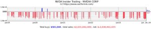
The CEO’s stock sales were practically perfectly timed with Nvidia’s recent high.
Not to put too fine a point on it…
I think that Nvidia is worth holding. But I do not think, at these valuations, that it should be any more than 1% to 3% of anyone’s portfolio.
So if you want to initiate a position? Throw a small amount in and prepare to hang on for what will inevitably be a wild ride.
If you have seen tremendous appreciation already and it’s now a significant proportion of your portfolio?
I would take a lesson from Nvidia’s executive team and trim your holdings.
When I ran a DCF analysis of Nvidia’s free cash flow and compared it to its peers in the semiconductor industry…
I can see the stock growing to $140 to $180 by 2030. That gives the company about 20% to 50% more upside over the coming years.
And that’s even if the company manages to maintain the skin-sloughing rapidity of its profit growth for the next 5 years, which it… won’t.
I’m not even going to hedge that claim. Nvidia will not be able to maintain the growth trajectory it’s on.
For anyone who thinks otherwise: I have some tulips to sell you.
– Sean MacIntyre
Check out Sean’s YouTube channel here.